JOSH BROOKS
WELCOME TO MY ONLINE PORTFOLIO
BACK TO THE TOP
- Here is my Portofolio Design Exercise, upon entering this module of Web Design Studio, our final product was going to be this website portfolio, created using Hotglue. To begin I had a small play around using the Hotglue interface online and created a first website, it doesn't look great at all, however the idea was to play around and get used to the interfaces tools. After that I began hand drawing and designing my interface look using wireframes, also writing down key information such as the purpose, skeleton etc. that i need for my website. Below you can see my designing process.
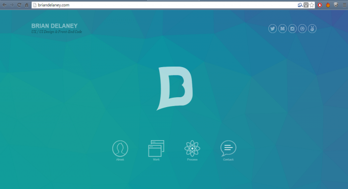
- To start with after testing the Hotglue interface, I looked into websites and designs to get inspiration, upon gathering lots of ideas from different websites, the best one I got the most inspiration from as it was a simple based design, was the one to the right - www.briandelaney.com. I liked the simple basic design and the colourful house style.


- Click on the arrow to continue my process journey onto Portfolio Implementation:
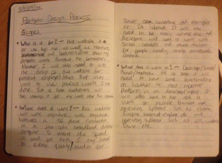
- After my research during one of my sessions, I started to wrtie down ideas and my design process for my website. It is always important to plan your website even down to just writing ideas as it's much better to come back to them as i often did. I started by writing down the scope for my website. Thinking about things like: Who is it for? Where does it work? What does it work on? These questions were important as I kept in my head while designing, that it should be visually pleasing and accessible for the viewer, not for me.
- Who is it for? - I believed it was for teachers and lecturers marking this assignment as this was part of it, however looking more broadly it can also be for future employers, to show off my original work.
- Where does it work? What does it work on? - My plan for this website was for it to work on anything, computers, laptops, tablets on any connection.
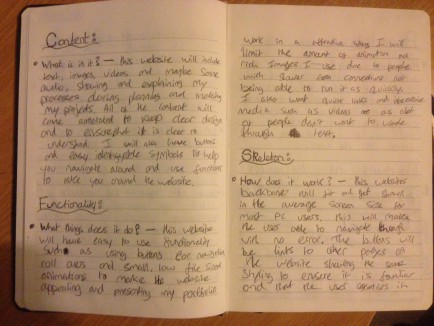
- I then began to think about the content of the website, what did i want to include in it. Obviously i was following a brief for the assignment however again i was thinking more broadly, looking at other website portfolio's and what they have included. So the question i asked was: What is in it? - I listed the obvious; images, video's, text and photographs, showing off my work and explaining my processes through each one.
- The next thing is functionality, what will my website be used for, what i wanted it to do. Again this seems like an obvious answer but planning these things do help you look at the design in a much more broad perspective. I asked: What things does it do? - I wanted this website to have easy navigation and a lots of interactive media. I even planned some things that I didn't end up doing, such as roll over banners and slide shows of imagery. However it was good to plan for it.
- Next it's thinking about the skeleton of the website, how will it work, how easy will it be to navigate. I found this simple. How does it work? - Well this website will have easy navigation, the backbone of the website shall keep with the same with all of the buttons and imagery fitting all in one house style. And the website will fit into all screen sizes so there will be no endless scrolling.
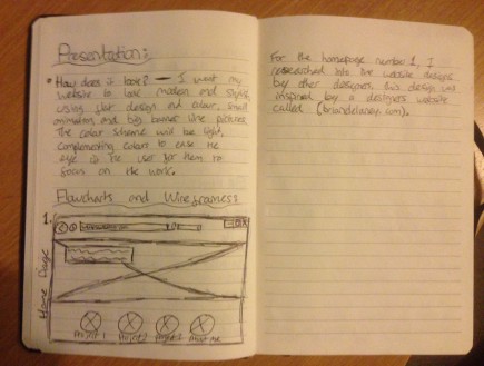
- Finally I began to think about the presentation of my website, how did I want it to look. So the final question: How does it look? - I planned for it to look modern, stylish but also simple and visually pleasing. I wanted a lot of imagery, colourful boxes and banners. In the end I decided to go with a more simple looking approach however I still kept with the colourful side of my plans.
- Then i started to begin drawing simple designs and wireframes.
- Onto the wireframes and design flowcharts, in these i wanted to make sure that i have planned all of these well to keep going back to them for guidance and to make sure that I have progressed my website to looking better rather than panicking and leaving the design of it all to the last minute.
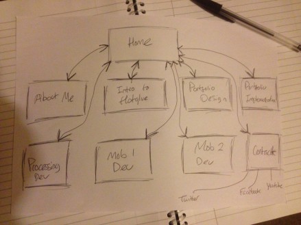
- Here my first look into my sketches, this is just a simple flow chart diagram that shows how many pages I will need and the links in between them. This shows it being all so simple as here my design was slightly different from the final product that you are viewing now.
- This is slightly different being here in my original diagram I was going to have everything linked from the home only, meaning the viewer would have to go back there to view somthing else, I changed this to make the navigation a lot easier. Also in this flowchart I had a separate page for a contact page.
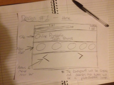
- Here is my first wireframe design of my Home page. My original idea from the start was to have a rolling banner across the screen with images in the background and the clickable buttons over the top of it, however I then began to rethink this idea due to Hotglue not having very stable extra coding and because I didn't what to over complicate the design and cause viewer issues with viewing it.
- I was going to have a colourful background which changed on each page as I do for my final website, with then having the buttons across the screen where the viewer can scroll through them and pick the page they want to go to, this was a good idea however I believe the scrolling of trying to find the page you want to go on was not needed, and should be all on the main page to make things easier to navigate.
- To take this further, I then began to separate the buttons from the rolling banner.
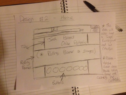
- Here is my second wireframe design of my Home page. Here I continued with the idea of using a rolling banner across the screen showing all of the images that I have created in all of my work in a slide show effect. Then having all of the buttons below that linking to all of the pages. I was also going to have the same, modern looking, colourful background to make my website appealing.
- This design was better in my opinion as I used more of the white space in my website and spreaded it out a bit more to give a better perspective of the visual design of the website. However again as I later found out, while trying to design the rolling banner of pictures, I found this very difficult to do using Hotglue's coding system and therefore decided to abandon the idea of using a rolling banner, making the website a bit more open and somewhat empty. Therefore i decided that I would need to draw up another wireframe of a new design.
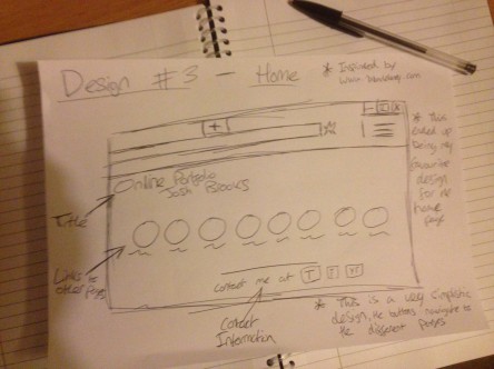
- Here is the new design I came up with, this third wireframe design was meant to be a really simplistic idea, however ended up being perfect for what I wanted, I wasn't too sure at first but once I created a draft of what it looked like on the website. I found that the simplistic design and used of having free space actually worked quite well and reminded me of the design by Brian Delaney. This design simply has all of the buttons in the middle of the screen all within the screen's width and then the contact information below it, rather than on a separate page. I kept the same background colourful style.
- Overall this design became my favourite and ended up being similar to my final product on the website. This design works really well as the viewer can see everything on this website within the first screen rather than having to look all over for what there looked for, their main focus is on the middle buttons which is meant to draw attention to it.
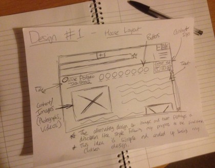
- Once I had finished all of my Home page designs, it was time to go into designing the main house style of all my webpages. I was going to originally design all of the pages separately however as i hadn't completed all of the content at this point (such as all of my projects), i decided to just design a 'house' style where I wanted it to be the same on each page.
- This first wireframe design ended up being the design I took forward as it matches the same simplistic design of the home page and uses the white space well. The layout is simple with all of the buttons linked at the top of the page next to the title, then all the content aligned alternately down the page. This gives the viewer a good sense of following the journey down the page, which makes it much more readable. This simple layout is very easy to follow and visually pleasing on the eye. I also decided that I will have the same background on each page, but just in different colours.
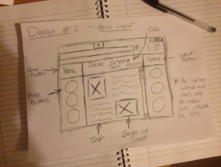
- I did create a second design on paper before taking forward into designing my website, and at the time this was my favourite as it went well with the rolling banner homepage I had been trying to make at the time. I did experiment using this design in the beginning however I changed it quite late as I went back and believed the first design was better fitting to the home page design.
- This second wireframe design was quite different for the other one, I was inspired more by generic block websites for this design, where the navigation was on the sides with all of the content aligned to a block in the middle of the page. This was good however it didn't really bring a strong appeal to it, I remembered from design websites in my college course that normally when people open websites, they look along the top and down the side first. Therefore with my website the viewer would not look at my content first, which is what I want them to do. Research article here - http://www.nngroup.com/articles/f-shaped-pattern-reading-web-content/