JOSH BROOKS
WELCOME TO MY ONLINE PORTFOLIO
BACK TO THE TOP
- Following on from all of my designs, I then began to implement all of my designs into Hotglue and actually try and create my website portfolio. And although I admit I do not like Hotglue one bit, i finally got my website looking like my final design ideas. Hotglue was quite hard to work with as it's got a basic design interface in which i'd prefer to work with something more advanced however with the skills that i currently have, this software was quite nice to warm myself into website creation.
- So I started developing the Homepage, I began with the design on the right, this design is very basic and somewhat very unappealing now, my main concern was creating a banner that went across the homepage displaying a slide show of pictures, although I ended up abandoning that idea due to not being able to put it into Hotglue, therefore I filled in the white space with text, which just makes it bland and boring.


- After developing the Home page, I decided to development the main house style on the About Me page and make it appear on all the other pages. I started by keeping the links and the layout the same as the Home page and just adding in the content in the middle. The background was the same and all the colour schemes was the same. I hadn't finished all of the buttons at this point so I just put placeholders in.
- After a review session within the class, I decided that mine didn't work at all, the design was very boring, plain and unappealing because of the mix of grey's and the overpowering sidebar's. Therefore I decided to go back to my notes and plans to rethink my designs, and I ended up drawing that new design (Design 3 on the Portfolio Design Exercise Page). I decided to scrap this whole design as after the review session in class, I decided that mine just didn't appeal to anyone and wasn't really drawing anyone into the website.
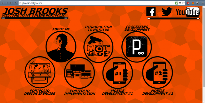
- After rethinking and experimenting, I ended up with this design on my Homepage, and I really like it. This design is so much different from my original mockup design as it is so much more appealing and colourful. At this point I decided I wanted a more vibrant website and therefore added in a more varied colour scheme where the background changed on each page. I replaced the dull grey tones with a much stronger and bolder black colour to make it stand out so much more. Also I removed all of the text in the middle to ensure that the main focus was on the buttons and the links to my work. I also scrapped the idea of having a contact page and decided to just add in icons at the top of the page as nowadays people understand the icons and what they mean. The text is also all in capitals to emphasize it even more, makes it much clearer and stronger. This is definitely a lot better than my original better, the whole look just gives it a more modern and stylish look that I was aiming for in my plans.
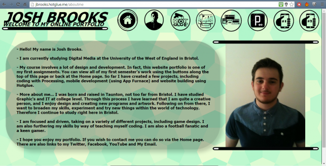
- After the success of my Homepage design, I then went back to my sketched designs where I relooked at my first wireframe design for the 'house' style of the other pages. I went back to putting all of the buttons along the top of the webpage instead of along the sides, and put the content fully to the edge of the screen. This fitted well with the research I gathered on where the viewers eyes look first. The images are 'held' by a bar which makes the webpage blend more, and look more professional. All of the buttons along the top don't have text underneath them as I believe the buttons are clear enough to understand, and also to remember from the homepage. All of the buttons were created using a mixture of Adobe Illustrator, Adobe Photoshop and GIMP.
- Overall this design of the 'house' style also works really well, the viewer can just follow the content down the page well showing a journey in my work.
- After creating the 'house' design of all of the webpages, I made it appear across all of the pages with the buttons along the top and the background staying the same, only changing colour for each project. The content as your viewing, rolls along down the page in an alternating fashion and works really well on each page. I also added in a late 'back to the top' button to make navigation even easier for the viewer.
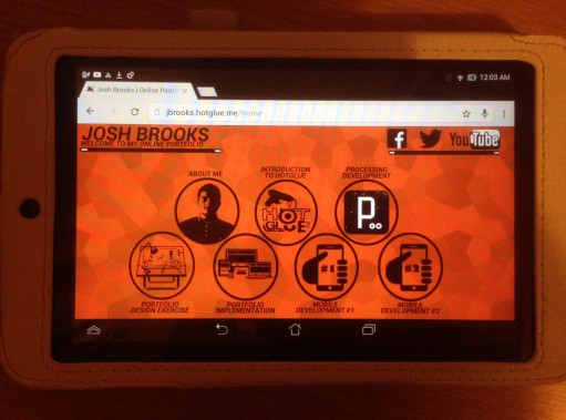
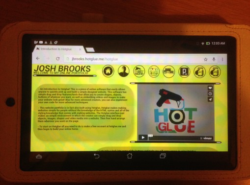
- During the creation of my website, I was constantly testing my website on different browsers, devices and even getting some of my friends to test it on their devices to ensure the design looked ok and all the navigation, and media worked. Here you can see photographs of my website running on my Asus MemoPad Android tablet. I found on all browsers on the computer and on my tablet worked perfectly fine and fitting the screen really well on each, I understand on some bigger screens, it may look a little smaller, however after zooming out on the browser, I believe the website fits well still, and on phone screens, you need a little bit of scrolling, however it's not too bad. Therefore after all the testing I found my website does exactly what I wanted it to do and all of my links and media worked perfectly.
- Overall, in conclusion, I believe my Hotglue website was a good success. I really like how it came out altogether. From the start my initial plans were to create a website that was modern and colourful, it had to be quite simplistic and have easy navigation. I wanted the website to be rich of imagery, with a few videos and overall I believe this has been very successful, I have matched my initial plans very well.
- The colour scheme is strong and bold, which makes it stand out a lot, the background is colourful on each page and therefore gives a strong appeal visually to it. The buttons are very recognisable and easy to understand. The layout of the buttons is also very easy to use and navigate with, the navigation as a whole makes it very easy to use the website. All of the web pages also work very well on all browsers and even quite well on other devices such as tablets and phones.
- Overall I am really happy with this as my final product, with the restrictions of Hotglue there were more things i'd like to add such as using rolling banners and more interactive design, however I believe that this project such been a success.